Skill tree example
This was an assignment where we had to create an interactable skill tree for a rpg game. I choose to do this in Unity in order to make a quick and dirty simulation that follows a couple of principles.
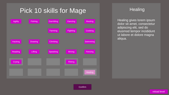
The whole idea behind my creation is the use the same color during the whole process. It starts out very simple where the user can select a class and "unlocks" a button as a result.
On the second page the user learns that certain buttons can be dragged. The play on colors and simple shapes makes it very easy to understand. The whole idea behind the interface so far is to keep it minimalistic information wise. You only see what you need when you need it.
After picking your skills you will see the skill tree which is based on your class. Certain skills belong to other classes. Here the same colors are used. Since the user is already familiar with the colors the user knows which things are clickable, even though it is never said.
The idea behind the tree is that every skill that you master gives the tree a purple ray of energy showing your progress. Since some skills are incremental it also has certain requirements.
Over the levels you get more composed and less chaotic. You can see this in the DNA design of the overall tree. At the bottom it is a lot more refined than at the top. My focus was mainly at how to make something interactable with close to zero information and how to make an user learn a certain rules without reading text. Due to lack of time I did not implement a feature that would teach WASD controls etc.
Controls:
Move around with WASD in the skill tree.
Click with left mouse click, all clickable objects will change from color when you hover over it.
Use full screen so that the window does not get cut off.
| Status | Prototype |
| Category | Other |
| Platforms | HTML5 |
| Author | ploopploop |
| Made with | Unity |


Leave a comment
Log in with itch.io to leave a comment.